Last week in your Friday Phil, I outlined
some strategy to picking artwork from my in-laws, with the caveat that we had
never really put it to the test. The reason was, for most of the significant
pieces of art we've acquired, we made it ourselves. I promised then to let you
in on our secret of how we do that.
Now, let's be clear: I love colour and
art, but am by no means an expert on painting or photography. I've heard the names Ansel Adams and Annie Liebovitz. I could recognize
Whistler's Mother and that one with the melted clocks by Salvador Dali. But I am by no means an art critic or could
even consider myself an aficionado.
(Side
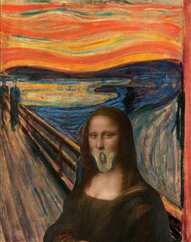
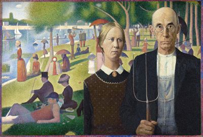
note: have painters ever considered doing mash-ups like musicians sometimes do?
If so, how do we not have the "Screaming Mona" or "An American Gothic in Paris"? Well, we do now! And somewhere an art historian is convulsing uncontrollably.)
Are these the only painting inspired by Linkin Park and Jay-Z's Collision Course mashup album? If so, you're welcome, art world!
But I love colour, I love art in so many
forms, and I love being creative, and here's a few ways you can achieve
interesting results that fit your space without breaking the bank.
Idea #1: Actually get good at painting
Watch a lot of Bob Ross. Practice with The Joy of Painting (maybe even buy the 10-DVD set!). Buy canvasses in
bulk to save on per-unit costs and practice your happy little trees. (Bonus
points if you get into it and grow a majestic afro.) As a result, you'll have
gained a really cool new skill AND you'll have made a new friend, may he rest
in peace.
Idea #2: Find somebody who's cheap and good
Commission a painting from a struggling
artist or a friend who dabbles. This way allows you less control over the
creative process, so make sure you have a solid discussion at the outset in
which you lay out your requirements. The result is a little less DIY, but
you'll get a real original piece of art and have supported the local economy
and/or a friend in need.
Idea #3: Photoshop 'til you drop
The following is the strategy we promised, which we've used twice to results we're very happy with:
Step 2: Search the Stock.Xchng or EveryStockPhoto for a free
or cheap stock photo that suits the theme you're looking for. Pay close attention to your rights as a user of the photo, particularly if you are considering selling your work.
(Alternative to Step 1 and 2: Skip this whole bit and find a photo you've taken in the past that you
love.)
Step 3: This step requires Photoshop or a
comparable product, which could easily be the most expensive part of the whole process if you need to buy it. (I've seen great results for free out of GIMP, but have never used it myself.)
Import the photo, resizing it so it's at least 300dpi and
the dimensions you want for your final piece. Then, save this as a separate
file to preserve your original in its pristine, untouched state. (Why do I
recommend this so strongly? I couldn't provide you with the step by step
instructions of what I did both times we used this process because I didn't follow this advice myself.)
Step 4: Copy the base
layer and start experimenting!
Want a painted look? Try working with
the Watercolor and/or Paint Daubs.
Want an ink drawing? There's a filter for
that too.
Want to keep the photographic look, but isolate a specific colour? Photoshop's Magic Wand or Magnetic Lasso Tools are great for that. Or (spoiler alert) do what we did in the bedroom, and take a black and white photo and add colours to it that suit your room!
Be warned though; most filters don't immediately produce distinctive, original
results; experiment with different foreground and background colours until you
get results you like.
If you're really brave, create a new layer
above your artwork, select an appropriately sized/shaped brush, and try to
recreate the photo. It's a little like Paint By Numbers meets The Internet. (If
you try this, I recommend creating a new layer for every colour you use.)
Step 5: Once you're happy with the look, find
someone who will print "photos" on gallery-wrapped or framed canvas. Groupon
used to sell coupons for a bunch of these kind of printers, but for our money,
we always used Costco Photo because they were very competitively priced, offer
a 36"x24" size that we wanted (most don't go that big), and we can
pick it up at our local store 10 minutes away.
Show and Tell
Now, this is useless unless we show you
what we did. Unfortunately we don't have the original photos we used, nor a snapshot of the "paintings" in progress; at the same time, the process of
experimenting with what looks good doesn't always yield linear progress
conducive to step-by-step instructions. That said, here are the final products"
 |
| Our first fake-painting using this method. |
For the first piece, we were inspired by
the aforementioned idea of dark tree trunks in a vivid forest. I was hoping for
more of a Monet-ish painted look (i.e. a natural landscape or image but not aiming for photographic realism) so I used the
Paint Daubs filter a bit, and because we wanted it to fit in our living room, I
worked in the espresso browns of our living room furniture as well as the blue
of our condo's living room's feature wall (now the darker blue in our office).
The result hung in our dining room at our condo; we haven't decided where it'll
end up in Grandpa Joe's House.
 |
| Our second, calmer fake-painting. (Actually, more of a faux-tograph perhaps?) |
The second piece we did we wanted to have
a more calming influence. Inspired by a photo of the aforementioned forest
glen, we filtered the photo (that was originally black and white) less heavily. I added in extra mist, but apart from
that, the most I did to adjust the photo was add some blurring (as much to hide
pixellation of a smaller photo as anything) and added the colour to the grass and tree. The finished result will hung over the espresso fireplace in our
bedroom in the condo, and when we picture that in our house, we still like that
idea.
One Way to take it to a whole. 'Nother. Level.
As a final note, if there's something a
gallery-wrapped canvas print lacks, it's--no, not a soul, although some
"real artists" might argue that point (and who am I to refute them?).
It's texture. But I saw a Thomas Kinkade 60 Minutes feature (that you can watch online) once that showed the Painter of Light in a whole new, well, light. His was a very commercial enterprise that offended many art critics who felt that art should be about
creativity, not formulaic cash cow exploitation, while Kinkade's defenders used a variation of the "subjective nature of taste" argument to justify the value of his endlessly-reproduced work; I'll let you decide where you stand
on that.
But one thing I saw that I've been reminded of recently is that he had a
crew of people who would take prints of his work and add spots of real paint to
various sections (maybe highlight the snowcapped trees with some real white
paint) to add texture and increase the value of the works when sold.
Thinking
about it now, why couldn't I do that to some of the prints I've made? Not to
add to their monetary value per se, but to add texture and make it feel more
"real." I could match some real paints to the colours in the print,
grab a brush, and spread it on thick. I've stocked that idea away for a rainy
day, but we'll be sure to let you know how it goes, for better or for
disastrously worse!
How about you? Have you created a painting
for your home and get any interesting (perhaps even Pinteresting) results?